Cotswold Data ltd.
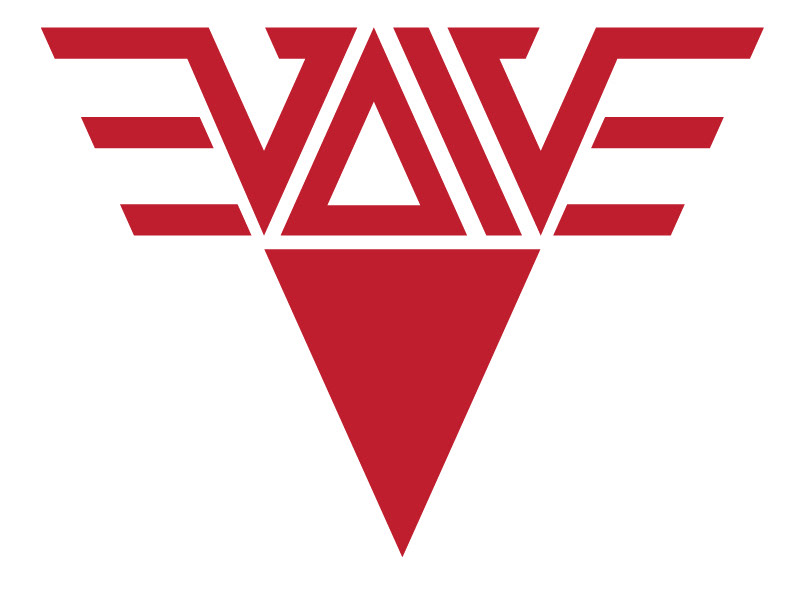
Cotswold Data. The client wanted something geeky to fit with the nature of their work. They "handle" data, and data at its simplest form (as far as pertaining to computers at least) is binary. So, if you were to enter the binary in this logo into some kind of translator it would actually say the word "data". A circle was used as a container, to represent a disk. This could be a hard disk from a drive, or floppy etc. The colour was based on their current company colours and was a requirement for the design.

